Hey there, web fam! 👩💻
Welcome back to Code With Kriti, where every tag I learn turns into a blog post 😄
Today’s “aha!” moment came from something we all love: Images!
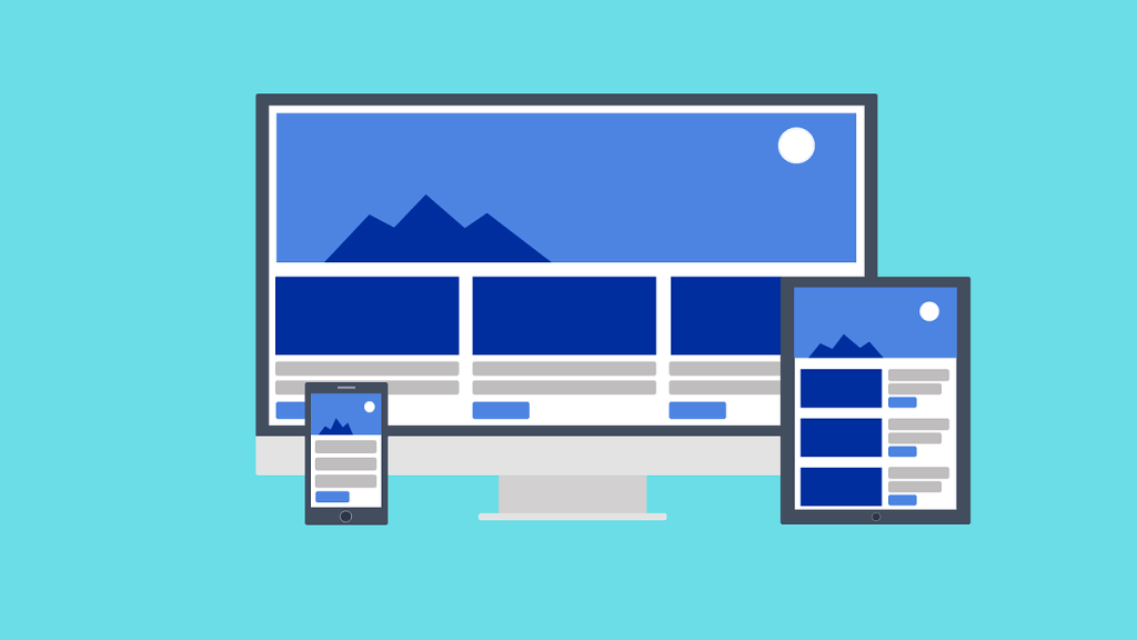
But not just pretty pictures — I’m talking about responsive images that actually fit the screen whether it’s a phone, tablet, or laptop.
🤔 Why Should Images Be Responsive?
Let’s be real. We live in a world where everyone’s on a different device.
What looks great on your laptop might look totally zoomed-out or broken on someone’s phone.
That’s where responsive images come in — they resize automatically based on the screen size.
✅ Better user experience
✅ Faster load time
✅ Looks polished and professional
🧪 My Mini Experiment
I tried adding a regular image using just HTML like this:
<img src="flower.jpg">
Looked fine on my laptop.
But on mobile? 😬 It overflowed right off the screen. Not fun.
✅ Solution 1: The CSS Way
Here’s the fix I used that worked like magic:
img {
  max-width: 100%;
  height: auto;
}
What does this do?
max-width: 100%→ makes sure the image never goes wider than the containerheight: auto→ keeps the image’s aspect ratio intact (no weird stretching!)
🧪 Code in Action
Here’s how I updated my HTML and CSS:
<img src="flower.jpg" alt="Bright pink flower blooming in spring">
img {
  max-width: 100%;
  height: auto;
  display: block;
  margin: 0 auto;
}
Alt text bonus! ← improves accessibility + SEO 💪
🌈 Bonus: Making It Mobile-Friendly
If you’re using media queries, you can tweak how images behave on smaller screens.
@media (max-width: 600px) {
  img {
    width: 100%;
  }
}
Just a few lines — and suddenly your site looks good everywhere 🌍
💬 Real Talk
This might sound like a small fix, but honestly, it made my whole page look so much better.
And it reminded me:
Sometimes, the smallest tweaks make the biggest difference — in both code and life. ✨
📸 TL;DR – How to Make Images Responsive:
- Always use
max-width: 100%in your CSS - Add
height: autoto preserve proportions - Test on different screen sizes!
- Don’t forget to add your
alttext too 😉
That’s all for today, my fellow code explorers.
If you’re learning like me, just know — it’s okay to Google a hundred times. What matters is we show up. 🧡
See you in the next tag.
Until then, happy coding & Ctrl+S often!
 CodeWithKriti
Leave a comment